
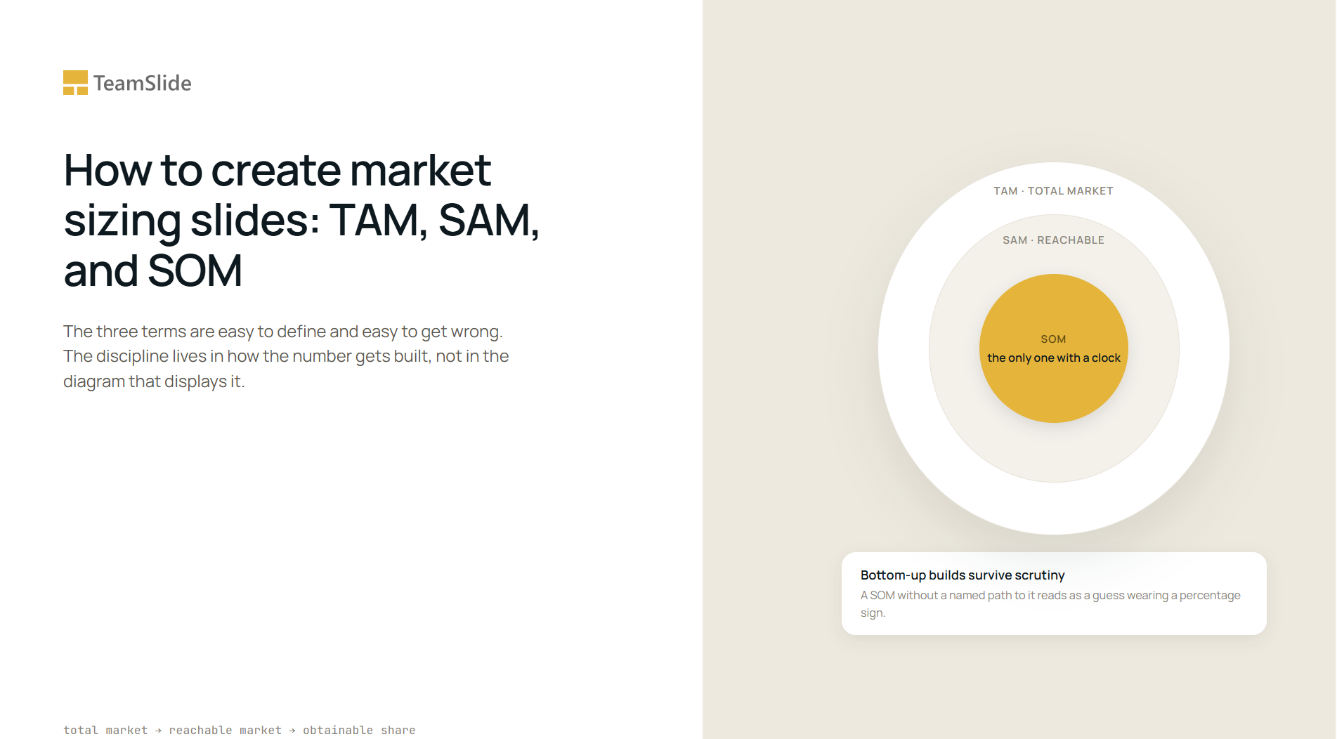

Most people assume a market sizing slide gets more convincing as the top number gets bigger. In practice the opposite happens: the larger the total addressable market on the page, the harder the room works to find the seam where ambition stops and arithmetic starts.
That instinct is exactly backward for what TAM, SAM, and SOM are supposed to do together. Each one answers a different question, and only one of them, the SOM, is the number anyone in the room will actually stress test. This piece works through what the three terms precisely measure, how the underlying figure gets built rather than just labeled, and three current examples from McKinsey, Bain, and BCG that got the discipline right in three different ways.
TAM, SAM, and SOM measure three different questions, not three sizes of one pie
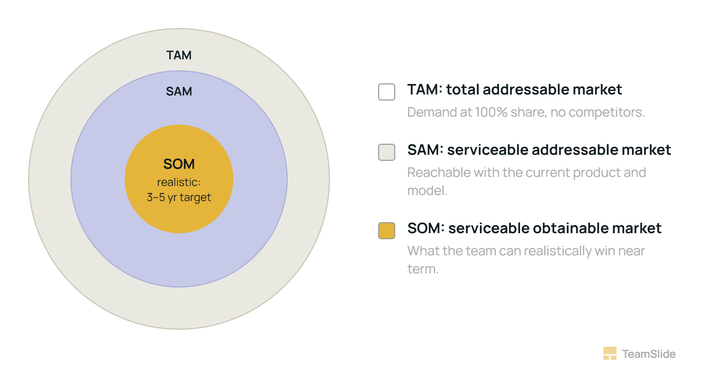
Total addressable market is demand at 100 percent share: every dollar that would exist if competition, geography, and capability all disappeared. It is a useful ceiling and a poor argument on its own.
Serviceable addressable market cuts that ceiling down to what the current product, channel, and geography can actually reach. This is where most of the honest thinking in a market sizing exercise happens, because it forces a team to say out loud which segments of the TAM they are choosing not to chase.
Serviceable obtainable market is the share of the SAM a team can realistically win in a defined window, usually three to five years, given its current sales capacity, brand, and competitive position. It is the only one of the three figures with a clock attached to it, which is exactly why it gets the most scrutiny.
The single most common failure in this exhibit is skipping straight from a large, unqualified TAM to a small SOM with the logic of “if we just capture one percent.” No company has ever accidentally captured one percent of a real market; every point of share is fought for against a named competitor doing the same math. A SOM that cannot point to the specific accounts, channels, or capacity behind it is a guess wearing a percentage sign.
Bottom-up survives scrutiny; top-down survives the first slide
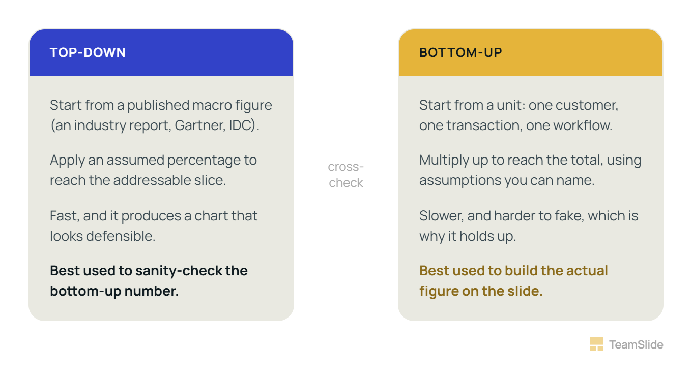
Top-down sizing starts from a published macro figure and applies a percentage to reach the addressable slice. It is fast and it produces a defensible-looking chart, but the number is only as trustworthy as the assumption used to carve it down, and that assumption is usually invisible to the reader. Bottom-up sizing starts from a unit, a customer, a transaction, a workflow, and multiplies up. It takes longer and it is harder to fake, which is precisely why it holds up better under questioning.
The habit is not unique to client work. According to a step-by-step market sizing methodology guide, these questions appear in roughly one in four first-round interviews at McKinsey, Bain, and BCG, and The same guide adds that Bain dedicates an entire first-round session to estimation in many countries and that McKinsey often uses it as a warm-up, though neither detail comes from the firms' own published materials, so it is worth treating as secondhand rather than confirmed. What is better documented is the standard interviewers are said to grade against: structure and the assumptions behind each number, more heavily than whether the final figure lands exactly right, which is the same standard a real market sizing slide gets held to once it leaves the deck and reaches a client's own analysts.
The two methods are not rivals so much as cross-checks on each other. A defensible sizing slide usually shows evidence of both: a bottom-up build for the actual number, and a top-down figure cited only to confirm the bottom-up estimate is not off by an order of magnitude.
Three current sizing exhibits, and the discipline each one is actually demonstrating
McKinsey's economic potential of generative AI report puts the technology's annual value at $2.6 trillion to $4.4 trillion, and the figure earns its credibility from how it was built rather than from its size: the firm assembled it from 63 named use cases spread across 16 business functions, then cross-checked that build against roughly 850 occupations and more than 2,100 detailed work activities across 47 countries. The lesson for a slide is not the size of the number, it is that a defensible TAM is a sum of named, countable parts, not a single macro figure with a multiplier attached.
Bain's research on agentic AI inside SaaS sizes a $100 billion near-term US opportunity, expanding toward $200 billion once agents handle work that spans multiple systems rather than one. What makes the exhibit disciplined is that Bain states what is already captured, $4 billion to $6 billion today, before it names the expanded ceiling, and then breaks the remaining opportunity down by function rather than presenting one aggregate figure. Naming the current, honest SOM before describing the larger TAM is a habit worth borrowing directly.
BCG's 2026 Global Wealth Report does the opposite move well: rather than sizing global wealth as one undifferentiated pool, it narrows to an explicit serviceable segment, clients holding $250,000 to $5 million in investable assets, and names the specific countries carrying that growth, India alone adding more than $2 trillion in total wealth by 2030. A SAM only becomes useful once it is defined tightly enough that someone could go build a target account list from it.
The “one percent of a huge market” pitch is a tell, not a strength
An unqualified TAM paired with a token capture percentage invites exactly the scrutiny it is trying to avoid, because it signals the team sized the opportunity before it segmented the market. The antidote is a MECE breakdown, mutually exclusive and collectively exhaustive, so the market is split into segments that do not overlap and that together account for the whole. Each segment then gets its own size, its own capture assumption, and its own timeline, and the SOM becomes an honest sum of those pieces rather than a single guessed fraction of one enormous number.
The exhibit shape matters less than what it discloses
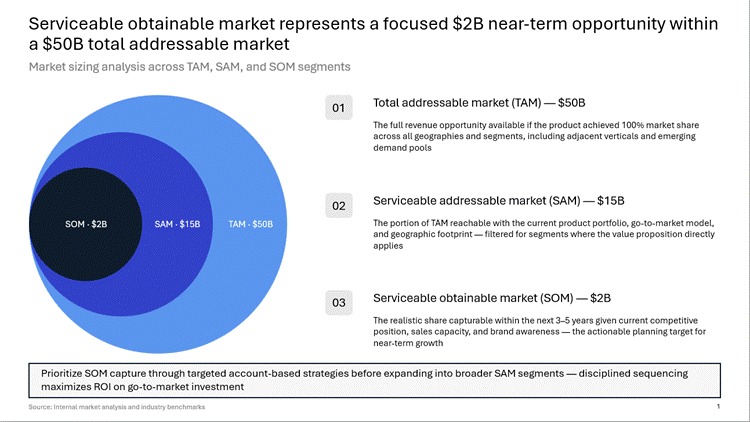
Nested circles are the most familiar convention for this exhibit, but a funnel or a stacked build-up bar chart works just as well; the shape is cosmetic. What actually earns trust on the slide is what sits next to it: the dollar or unit figure on each ring, one line stating whether the number is bottom-up, top-down, or triangulated, and a source trail a reader can follow back to the underlying assumption. A slide that shows a shape without a method note is asking to be taken on faith.
Before presenting a Market Sizing slide
Can you name the specific assumption behind the SOM percentage, out loud, without checking notes?
Does the TAM cite an actual source rather than a remembered figure?
Are the underlying segments mutually exclusive and collectively exhaustive?
Does the slide state, in one line, whether the build is bottom-up, top-down, or triangulated?
Would the number survive a direct “how did you get that” question from the most skeptical person in the room?
The slide that wins the room is rarely the one with the biggest outer circle. It is the one where every ring, down to the innermost, can be traced back to an assumption someone in the room is willing to defend.
Building the exhibit is the easy part once the number is right
TeamSlide's slide generator turns a rough set of TAM, SAM, and SOM figures, along with the one-line method note behind them, into a formatted market sizing slide in your own template, so the time saved goes back into checking the assumption, not into drawing the circles.
Questions worth answering directly
What is the difference between TAM, SAM, and SOM?
TAM is total demand at 100 percent market share, SAM is the portion of that demand reachable with the current product and go-to-market model, and SOM is the share of the SAM a team can realistically capture within a defined window, usually three to five years.
Should market sizing be done top-down or bottom-up?
Bottom-up is generally the more defensible method because it builds the figure from countable units, customers, or transactions rather than applying an assumed percentage to a macro figure; the strongest exhibits use bottom-up for the actual number and top-down only as a sanity check on the order of magnitude.
How big should SOM be relative to SAM?
There is no fixed ratio; the honest answer is whatever percentage the team's current sales capacity, competitive position, and timeline can actually support, and that percentage should be defensible segment by segment rather than asserted as a single round number.
Do McKinsey, Bain, and BCG actually use the TAM, SAM, SOM framework in client work?
The three firms do not always use those exact three letters, but the underlying discipline, sizing an opportunity from named, countable parts and being explicit about what is currently captured versus what remains addressable, shows up consistently in their published research, including recent McKinsey, Bain, and BCG market sizing reports.
What is the “one percent of a huge market” mistake?
It is the practice of citing a large, unqualified TAM and then claiming a small percentage of it as achievable without showing the underlying math; no company captures market share by accident, so a SOM without a named path to it reads as a guess rather than an estimate.
What does MECE mean in the context of market segmentation?
MECE stands for mutually exclusive, collectively exhaustive, meaning the market is split into segments that do not overlap and that together cover the entire market, which allows each segment to be sized independently rather than sliced arbitrarily out of one aggregate figure.
What should a market sizing slide always disclose alongside the number?
It should disclose the specific dollar or unit figure on each layer of the exhibit, a one-line note on whether the sizing method was bottom-up, top-down, or triangulated, and a traceable source for the underlying data, regardless of whether the visual is nested circles, a funnel, or a stacked bar.
How often should a market sizing slide be updated?
Whenever a material input changes, a new pricing tier, a new competitor, a shift in the addressable geography, since a market sizing exhibit is only as current as its underlying assumptions and stale inputs are the fastest way for a defensible slide to become an indefensible one.