
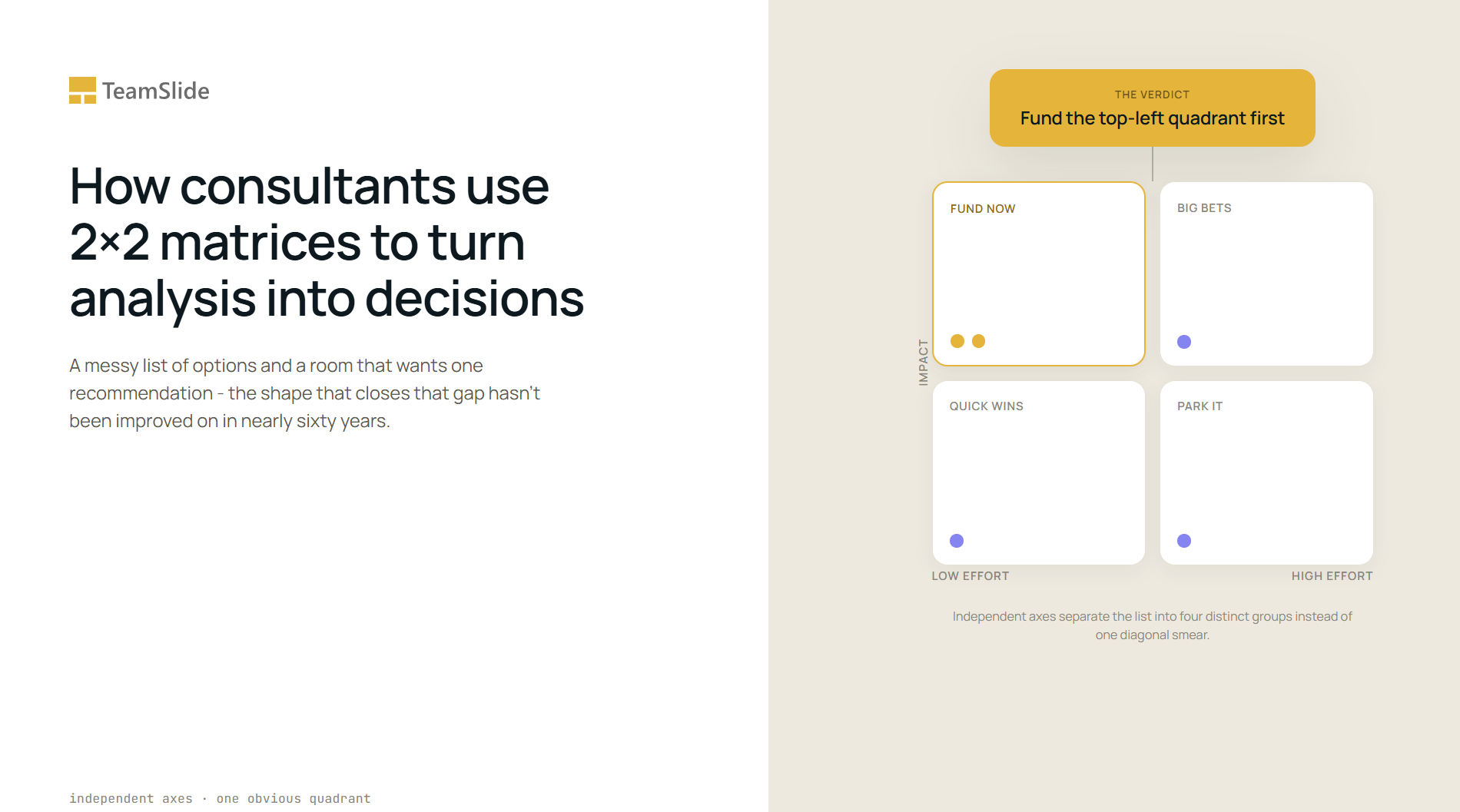

Six market entries, four vendor bids, a dozen initiatives fighting for the same budget: none resolve themselves on their own. Someone has to turn the list into a recommendation, and that is the one job a 2x2 does better than a bullet list, a heat map, or three paragraphs of prose. The shape has held its place in McKinsey, BCG, and Bain decks since Bruce Henderson's growth-share matrix made it famous at Boston Consulting Group in 1968, surviving because forcing a choice onto two axes turns a page-long argument into a same-day recommendation. Most of what a 2x2 gets right or wrong still comes down to two questions: are the axes doing real work, and does one quadrant obviously win.
Two requirements, and the failures all trace back to them
The first requirement is that the two axes measure genuinely different things. Independence means moving along one axis should tell you nothing about where an item sits on the other. Ease of implementation and customer demand can move independently; ease of implementation and internal enthusiasm for the idea usually cannot, because the ideas a team finds easy tend to be the ones it already likes. An axis pair that quietly measures the same underlying variable twice produces a diagonal smear instead of four distinct groups, and a diagonal smear settles nothing.
The second requirement echoes the MECE principle that underpins most structured problem-solving: the two dimensions should be collectively exhaustive of the decision at hand, covering everything that actually matters to the recommendation and nothing that doesn't. A matrix that leaves out cost, or risk, or time to market, when one of those is the real constraint, will place every item correctly on paper and still point to the wrong answer.
Both requirements point to the same outcome. One quadrant should read as the obvious answer before anyone reaches the headline. A matrix that produces four equally plausible quadrants has not simplified the decision, it has relocated the argument to a different part of the slide.
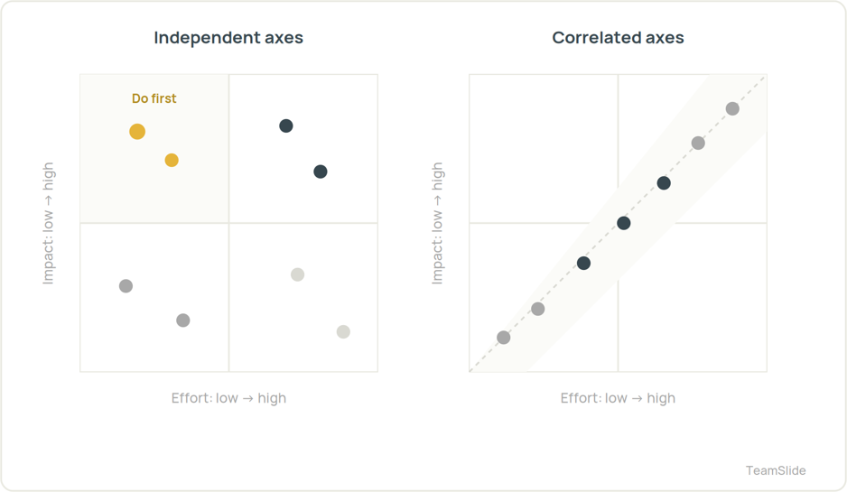
Three failure modes account for most of the bad ones, and each is a way of breaking one of those two requirements. Correlated axes, described above, break independence: they crowd everything onto a diagonal and leave two quadrants empty. Four equally attractive quadrants usually mean the axes were chosen for visual balance rather than for the decision, so they miss what actually matters and hand the reader a picture with no verdict. And axes chosen backward, built to justify a conclusion the team reached before the analysis started, are the hardest to catch, because the slide looks perfectly rigorous. The tell there is that the winning item would still win no matter which two dimensions had been picked.
One shape, three different jobs
Strip away the topic and most 2x2 slides in a deck are doing one of three jobs. Naming which job a given slide is doing, before building it, is most of the design work.
The first job is prioritization or screening: narrowing a long list of initiatives, markets, or acquisition targets down to the few worth pursuing now. An impact-versus-effort matrix, plotting expected business impact against implementation effort, is the version most teams reach for first, and it earns that popularity because it forces exactly the tradeoff a steering committee has to make anyway: fund the high-impact, low-effort items now, park the high-effort ones for later, and stop spending meeting time on the rest.
The second job is competitive or capability positioning: placing rival products, vendors, or business units against each other on the dimensions a buyer actually cares about. Gartner's Magic Quadrant is the best-known version at scale, plotting technology vendors on ability to execute against completeness of vision to sort them into Leaders, Challengers, Visionaries, and Niche Players. The value isn't the four labels, it's that the two axes were chosen to answer the question a buyer is actually asking: can this vendor deliver today, and will buying from them still make sense in three years.
The third job is archetype or segmentation: sorting a set of options into a small number of qualitatively different strategic postures rather than ranking them on a single scale. Igor Ansoff's product-market matrix, first published in the Harvard Business Review in 1957, plots new against existing products on one axis and new against existing markets on the other, and is the clearest example. The four resulting archetypes, market penetration, market development, product development, and diversification, name different growth strategies rather than different scores on the same one. A segmentation 2x2 done well produces categories a reader can name and act on differently, not four buckets of the same advice.
The forcing function is also the weakness
The same property that makes a 2x2 useful, compressing a decision onto two dimensions, is also its biggest limitation. Henderson's matrix assumed high relative market share reliably produced cash through the experience curve, and BCG's own strategists have since found that market share no longer predicts performance the way it once did: businesses now cycle through the matrix's quadrants roughly twice as fast as they did two decades ago, and BCG argues the framework now needs a broader measure of competitiveness layered on top of the original two axes. The matrix also treats every item as independent, which understates how much modern business units actually share customers, platforms, and supply chains.
None of that retires the format, it just marks its edges. A 2x2 works when a decision genuinely reduces to two dimensions and the goal is to force a choice among a manageable set of options. It stops working when three or four variables actually drive the decision, when the items are too interdependent to score separately, or when the honest answer is “it depends,” and dressing that up as four clean quadrants misleads more than it clarifies.
From a messy list to a finished slide in four moves
Building any of the three jobs above follows the same sequence, and skipping a step is usually what produces the failure modes described earlier.
Pick the decision first, not the axes. What is this slide actually deciding: which three initiatives get funded, which vendor gets the contract, which growth strategy gets a business case? The decision determines which two dimensions matter, not the other way around.
Pick the axes second, and stress-test them against the independence and exhaustiveness checks above before placing a single item. If two axes correlate, or if a third dimension keeps intruding on the conversation, the axes are wrong, not the data.
Place the items third, and treat clustering as information rather than noise. If every item lands in one quadrant, either the axes are too narrow for this list or the list itself is less varied than the room believes, and both are worth saying out loud before the slide ships.
Write the so-what headline last. A 2x2 titled “Initiative prioritization matrix” describes the slide; one titled “Two initiatives are high-impact and low-effort, fund those first” tells the reader what to do with it. The headline is where the forced choice actually gets stated in words, not just implied by a highlighted box.
Those four moves are also exactly what a slide generator needs from a single prompt: the decision stated as a title, the two axes named, and the items placed with a reason for each. The two slides below were each produced from one prompt, with no manual box-drawing or label-nudging afterward.
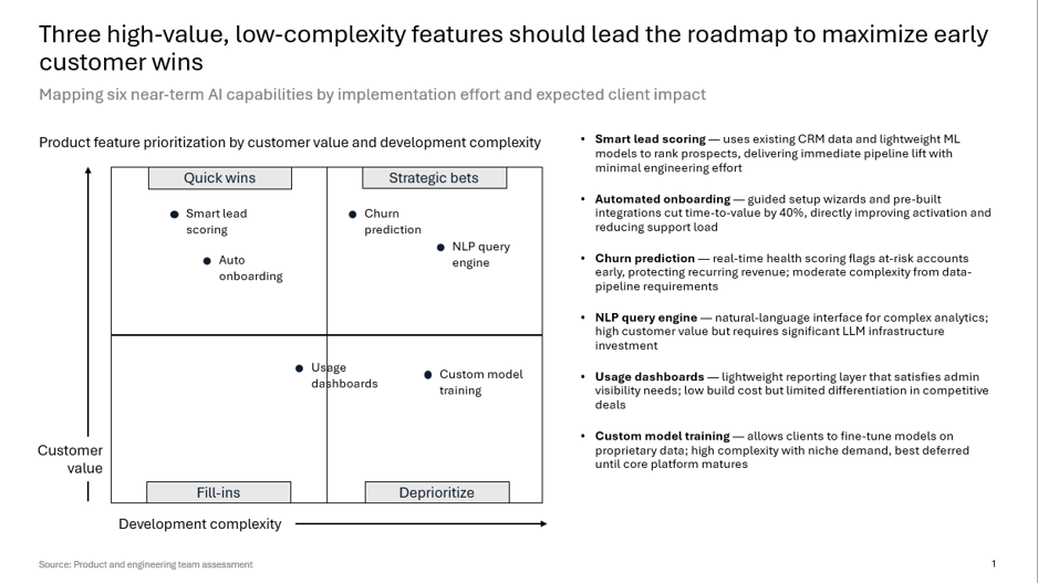
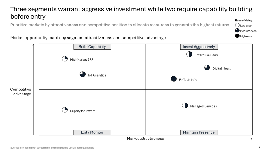
None of the four moves above takes long. Naming the decision, picking two axes that survive the independence test, and writing a headline that states the recommendation is normally a ten-minute conversation, not far from the one Henderson's team was having with clients back in 1968. Everything after that is formatting: drawing the boxes, sizing the labels so nothing overflows, getting the highlight right so the recommendation reads as a recommendation and not decoration. That part can eat an hour, and it is the wrong hour to be spending.
Because the part that matters was never the boxes. Stars, cash cows, Leaders, Niche Players, market penetration: the memorable four-name labels are what people carry out of business school, but they were never what made any of these slides work. What made them work was two axes chosen well enough that, once every option landed on the grid, the right answer was already sitting in the corner before anyone wrote the title.
Questions worth answering directly
What is a 2x2 matrix used for in a consulting deck?
A 2x2 matrix forces a long list of options, such as initiatives, vendors, or markets, into a single visual recommendation by plotting each item against two chosen dimensions. It is used whenever a slide needs to turn a messy list into a clear “do this first” verdict rather than just presenting the options side by side.
What makes a good pair of axes for a 2x2?
Good axes are independent of each other and collectively cover what actually matters to the decision. If moving along one axis predicts where an item sits on the other, the axes are correlated and the matrix will crowd everything onto a diagonal instead of separating the options into distinct groups.
What's the most common mistake when building a 2x2 slide?
The most common mistake is choosing axes that produce four equally attractive quadrants, which hands the reader a picture instead of a recommendation. A close second is picking axes backward, after the team has already decided on an answer, so the matrix looks rigorous but was never actually doing the deciding.
Is the BCG growth-share matrix still used today?
Yes, in a modified form. BCG itself has revisited the framework and argues it remains useful for managing a portfolio of businesses or products with different growth rates and market positions, though most practitioners now adapt the original thresholds to fit faster-changing markets rather than applying them exactly as Bruce Henderson defined them in 1968.
What is the Gartner Magic Quadrant actually measuring?
It measures technology vendors on two axes: ability to execute and completeness of vision, sorting them into Leaders, Challengers, Visionaries, and Niche Players. The quadrant names get the attention, but the underlying axes are what make the comparison useful to a buyer deciding among vendors.
How many items should go on one 2x2 slide?
Enough to make the pattern visible, but few enough that no quadrant becomes an unreadable cluster of overlapping labels, which in practice is usually somewhere between four and ten items. A 2x2 with only two items rarely needs the format at all, and a 2x2 with thirty items needs a table or a different visual first.
Is a 2x2 the same thing as a nine-box grid?
No. A nine-box grid, such as the one GE and McKinsey developed for portfolio planning, adds a middle band to each axis to capture moderate cases, producing nine cells instead of four. A 2x2 is the simpler, more forceful version, used when the decision genuinely reduces to a binary choice on each dimension.
How should the headline on a 2x2 slide be written?
The headline should state the recommendation the matrix supports, not describe the chart. “Two initiatives are high-impact and low-effort, fund those first” does the job; “Initiative prioritization matrix” does not, because it leaves the reader to work out the verdict for themselves.
The spec above is the hard part, and it's already done
Once the decision, the axes, and the item placements are settled, turning that spec into a formatted 2x2 slide is the part TeamSlide's AI slide generator handles: paste the prompt in, get a clean, on-brand slide back, and finish it in PowerPoint.
→ Join the Wailist